
Summary
Only the 1914-1929 stock market period parallels what we see today in both the Dow Jones Industrial Average and S&P 500 Indexes.
U.S. Real Gross Domestic Production may likely see a few more quarters of robust expansion, before contracting for the first time in years.
Historical yield curve, volatility, and consumer sentiment link directly to higher unemployment, implying that a meaningful pattern exists.
Economic expansions may be accelerated, but not prolonged.
What we see right now across financial markets is likely the last gasp for air by those “last to climb up the ladder.”.
In September of 2017, Centaur Investments published an article titled:“Predicting the Direction of the Stock Market and the U.S. Economy.” The article discussed a number of key developments posing risks to U.S. financial markets. The article was well-received by the Seeking Alpha community. For those who have not yet read it, the article is available here.
The timing is perfect for a follow up article because as of December 2017, the “Tax Cuts and Jobs Act” has finally become an economic reality. Following the bill’s passing, the market continues repricing in response to the effects this bill will have on the U.S. economy. Some may have believed the advent of tax reform was already fully priced-in. Yet, all major U.S. stock market indexes continue to reach record highs. The extension of this rally has turned out to be quite a surprise for both the investor and bystander. Per The Wall Street Journal, onlooking individual investors have finally started to “dive-in” to financial markets.
At the start of the month, the SPDR Dow Jones Industrial Average ETF (DIA), SPDR S&P 500 Trust ETF (SPY), and PowerShares QQQ Trust ETF (QQQ), continued to build momentum on top of last year’s record highs. These ETF's closely track the three major stock market indexes which underlie the funds; Dow Jones Industrial Average, S&P 500, and NASDAQ, respectively. The index performance is illustrated in the next graph.
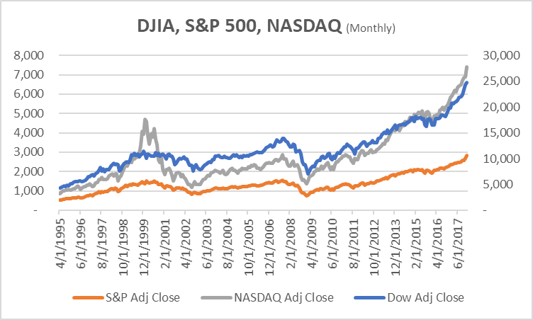
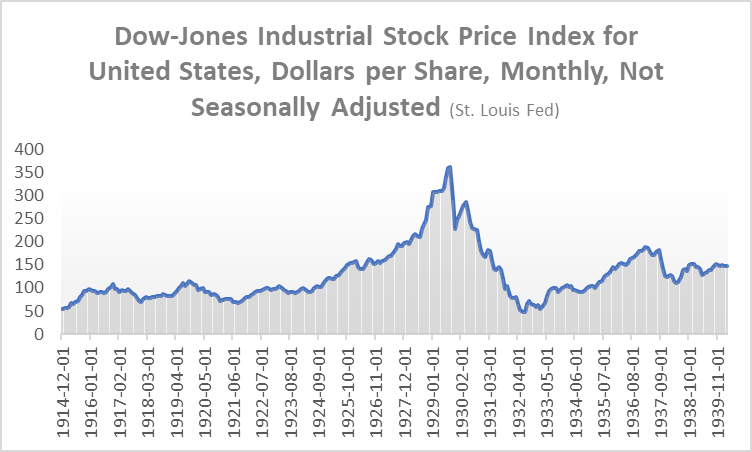
Looking back at history for patterns of similar trends to what we see today in the Dow Jones Industrial Average and S&P 500 Indexes, only the 1914-1929 stock market period is similar. For comparison, below you will find a chart of the "Dow Jones Industrial Stock Price Index" from December 1914 to December 1939, as sourced from the St. Louis Federal Reserve FRED Database.
Dow Jones Industrial Average from 1914-1939, see a resemblance?
The financial system has proven extremely resilient and well-insulated following the Dodd-Frank Act’s mandates for stress testing and increased capital requirements. Does this mean that financial crises, recessions, and depressions are simply a thing of the past? The answer is no; absolutely not. This fact is well stated in post-financial-crisis-era memoirs written by first responders such as former Treasury Secretary Hank Paulsen, New York Fed Governor (and later Treasury Secretary) Tim Geithner, and Fed Chairman Ben Bernanke. Though the literature serves well in communicating the improvements made to strengthen the financial system from crises, it likewise proves that even the most qualified and experienced regulatory body cannot fully prevent an all risks-off fire-selling event. Consequently, it is still impossible to prevent the economic downturns that follow these events.
To build a case, the next few sections will dive into economic data that will illustrate beyond financial markets, what history appears to tell us. Along with graphical illustrations, this article includes some comments on the current political climate. The idea is for the reader to grasp the reality of what is happening today, and hopefully walk away with a better understanding of the inner-workings of the macroeconomy.
The remainder of this article is organized as follows. First, we look at gross domestic production, and follow up with a brief sector analysis. In later sections we review credit markets and present separate views on corporate and household debt. Some critical evidence is used here to argue that economic expansions may be accelerated, but not prolonged. The view concludes that even with business-friendly public policy action, the current economic expansion is unlikely stretch beyond ten years. If the expansion does stretch beyond that horizon, it would be wildly at variance with the data, at least, from the last four decades.
Reflections on Digital Currency and Economic Indicators
It is the opinion of the writer that what we are seeing right now across financial markets is the "last gasp for air by those last to climb up the ladder.” This opinion was shaped by a variety of sources of information, some of which are presented in this article. The other sources of information are subjectively based on passive observation of user comments on social media platforms such as Stocktwits and Twitter. These social media outlets now resemble a cyber version of the conversations held in dive bars and barber shops of America, at the peak of the dotcom bubble. Like the typical stock market ‘aficionado’ of the 2000’s bubble, there are many who now speculate on stock prices moving higher for reasons no other than “all boats must rise.” This sort of speculation was observable for months, before a series of events took down the valuations of blockchain-based digital currency. Setting aside this subjective observation, let us now take a random walk through time.
To best project what will happen in credit markets, one must first understand gross domestic production which has expanded for nine years now. The International Monetary Fund (NYSE:IMF) recently upped their outlook for the global economy, backed by compelling changes to U.S. tax laws. The consensus seems to be that U.S. economic output will influence global economic output. Have a look at the graph of current U.S. real gross domestic product.
U.S. Real Gross Domestic Product
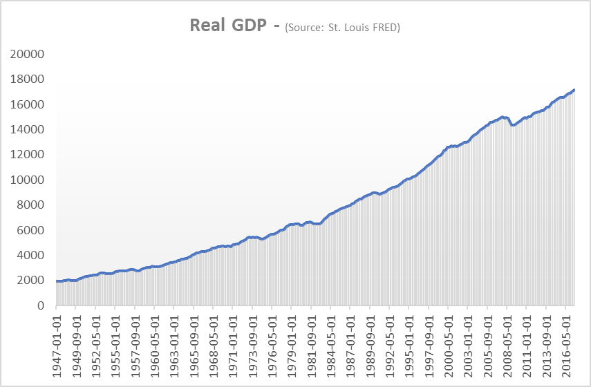
The most recent reading of real GDP came in at $17.2 billion for Q4 2017 (Seasonally Adjusted, Real GDP, Chained 2009 Dollars). This figure is now roughly 14.5 percent above the Q3 2008 peak of $14.9 billion (Seasonally Adjusted, Real GDP, Chained 2009 Dollars). What is striking here is that the past two measures of GDP annualized growth were above 3.0 percent. Despite the almost parabolic trend in U.S. real GDP over time, one can observe the minor contractions in the graph, during recessions. U.S. real GDP annualized growth rate is further detailed in the image below.
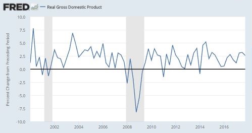
One widely-discussed argument is that with the U.S. economy already near full employment, things may soon start to overheat. Still, an absence of inflation or significant wage growth has some continuing to question the Federal Reserve’s credibility. Studying the annualized growth rates for real gross domestic output following the bursting of the dot-com bubble, an overheating economy appears consistent with readings above 3.0 percent. In recent times, a reading above 3.0 percent had not observed since the oil market collapsed in 2014, as global output slumped. That has all changed now with the last two quarters of GDP measures reaching 3.0 and 3.2 percent during Q2 and Q3 of 2017, respectively. All else equal, if the past serves as evidence we may be able to see more measures above 3 percent over the next few quarters. However, there are a few caveats which will be discussed later. For now, let us take a look at sector performance this year.
Bloomberg Sector Returns, Year-to-date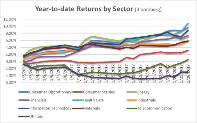
Overall stock market performance, as broken down by sector in the above image, show Consumer Staples, Telecom, and Utilities as the three lagging sectors so far, year-to-date. Indeed, these are the sectors which investors tend to rotate into during a bear market. Though, Telecom is starting to quickly close that gap. Recall that last year, telecom companies such as AT&T Inc. (T) and Verizon Inc. (VZ), suffered from falling mobile data and plan prices amidst increased competition. Sales of premium smartphones from companies such as Apple Inc. (AAPL) and Samsung Electronics Co. Ltd., appear to be doing well. Further, cellular service prices appear to have bottomed, and competitive factors have subsided for now. Following the T-Mobile US Inc. (TMUS) and Sprint Corp. (S) tie-up which fell-through in late 2017, expect for telecom companies to focus more on investment and building out their new 5G networks. Conversely to what most analysts predict, it is likely that these added costs will keep mobile plans from declining further.
Utility companies on the other hand, are not doing so well in an increasing interest rate environment. It should be noted that utilities may stand to benefit from rising natural gas and overall energy price levels. Companies such as Exelon Corp. (EXC) and NextEra (NEE) have invested heavily to diversify generation capacity. Exelon for instance, has increased its exposure renewable energy such as solar and wind. Though it remains unclear how tariffs on imported solar panels will to impact the cost of solar energy generation, moving forward. Nevertheless, the current political environment continues to demonstrate preference to business-friendly policies. A notable example is the recent decision by the FCC to repeal neutrality.
Financials is the sector which continues to worry some investors. More specifically, the consumer lending industry is one that worries some investors the most, as household debt continues to climb. Looking at year-to-date returns versus industry benchmarks, such as the NYSE Financial Index, shows that performance of some of these risky lenders has started to outpace the rest of the sector. The rate of credit card delinquencies, new account charge-offs, and higher loan-loss provisions seems to be signaling something.
The idea here is that riskier lending in the consumer credit market might just offset the benefits from lower corporate taxes, and any respective increase in aggregate demand associated with the expected economic boom. If this turns out to be the case, earnings will likely be muted and market participants may not like that outcome. A few consumer lenders worth watching are: Ally Financial Inc. (ALLY), Capital One Financial Corp. (COF), Synchrony Financial (SYF) and Discover Financial Services Inc. (DFS). The shares of these companies may start to pull back if further deterioration in consumer credit continues to impact earnings. Further, as Capital One’s recent earnings recently demonstrated, increased competition from non-bank lenders may continue to weigh on top-line growth, adversely impacting the valuations of these companies.
NYSE Financial Index YTD Returns Vs. DFS, SC, SYF, ALLY, and COF
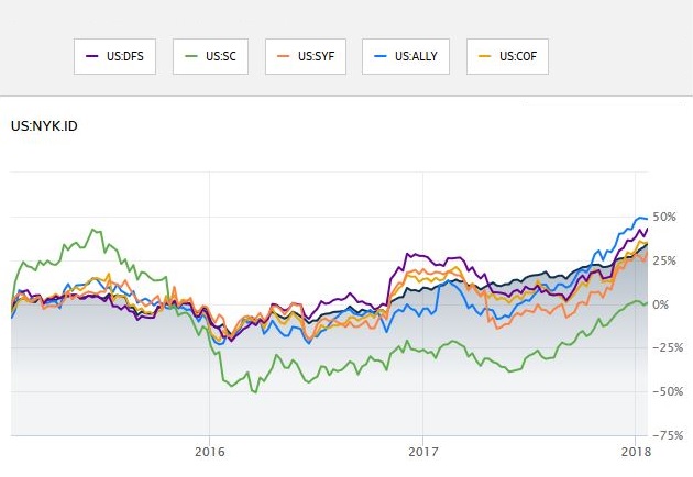
Source: WSJ
Let’s move on now to an outline of the ramp-up in debt, following years of low interest rates. The information presented in these final sections may serve as a warning for investors looking for an exit strategy, as the market rally continues into the earnings season.
The Ramp-up in Corporate Debt
The illustration below represents the market capitalization of commercial paper accumulated during the current business cycle. The cycle follows efforts by the Federal Reserve Bank to spur economic activity, as the nation’s unemployment rate hovered stubbornly above seven percent. Years of easy money policy incentivized companies to start borrowing again. While some companies used this as an opportunity for expansion, others simply took advantage of cheap debt to fund lucrative share repurchase plans. If your income was pegged to the appreciation your employers stock price, wouldn’t you do the same?
Commercial Paper of Non-financial Companies, Billions of Dollars, Weekly, Not Seasonally Adjusted
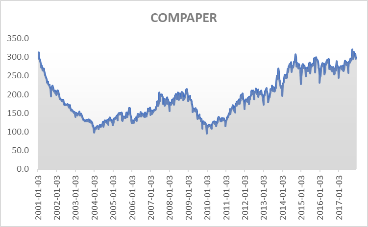
Source: St. Louis FRED Data
This is just commercial paper; approaching levels far higher than they were during the crisis. Longer-term unsubordinated corporate debt levels are also hovering at historic highs, just as the Federal Reserve starts to unwind its nearly $4.5 trillion balance sheet. What is even more worrisome, is the amount of subordinated corporate debt, particularly in the high-yield credit market. Following the drying up of credit markets in August 2007, politicians and central bankers scrambled to stimulate the flow of credit. Once lending confidence was regained, credit markets began to flow again. However, an unintended consequence of these new policies was this: it became even easier to borrow. The image below represents just the tip of the iceberg.
Asset-backed Commercial Paper Outstanding, Billions of Dollars, Weekly, Seasonally Adjusted
 Source: St. Louis FRED
The graph above illustrates the trend in asset-backed commercial paper. These are short-term credit assets, backed by physical assets other than the good intentions of a company. The amount of asset-backed commercial paper available is pretty low compared to the total market value of commercial paper, as illustrated in the first chart. Holders of most of these credit instruments may stand to lose in an all-risks-off event, as credit markets start to freeze. This also means that the next credit crunch may potentially be worse than the last one.
Who are the holders of commercial paper? In 2007 it was mostly money market funds and other larger funds, such as, insurance and mutual funds. During an economic downturn, credit markets will dry up. When the next one happens, the U.S. Treasury will have little firepower to help boost demand. Recent U.S. corporate tax reform is generating a giant hole (a $2.5 trillion hole) for the Treasury department, which will have to fill by borrowing from financial markets, again, just as the cost of borrowing starts to rise.
When you think a debt problem cannot get any bigger; there’s household debt.
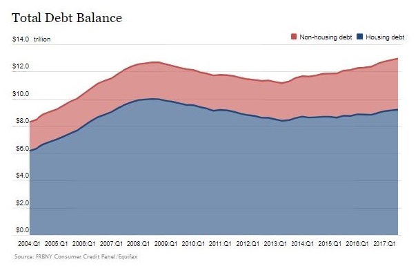
In November of 2017, the New York Federal Reserve Bank’s Center for Microeconomic Data published its latest Quarterly Report on Household Debt and Credit. The report revealed that:
“As of September 30, 2017, total household indebtedness was $12.96 trillion. This increase put overall household debt $280 billion above its 2008 Q3 peak, and 16.2 percent above the 2013 Q2 trough.”
While many argue that these fears are “baked” into financial sector stock prices, it is the opinion of the writer that the pace in household debt accumulation in unsustainable. The record level of household debt will eventually start to adversely impact the financial sector. This research continues to be largely ignored by market speculators. Revenue growth and record payouts to shareholders on behalf of financial firms, has helped support the bullish take on the sector. Most analyst continue to see financial stocks heading higher.
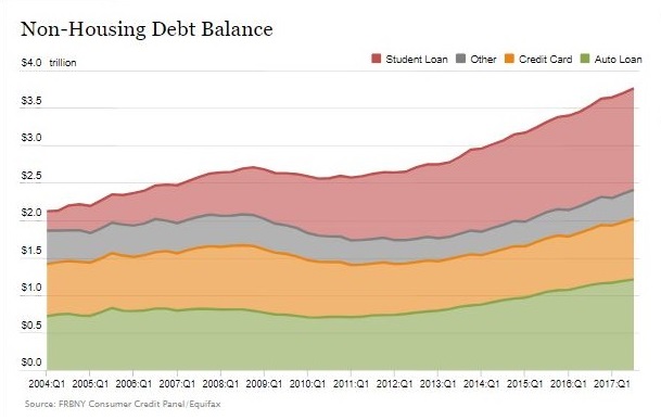
Breaking down household debt into subsections, it becomes more apparent that value of student loans outstanding, is a severe problem. One situation worthy of monitoring, is precisely how business-friendly the current administration becomes. As an example, the Trump administration tussled with regulators to appoint a new head of the Consumer Financial Protection Bureau (CFPB). Some believe the CFPB now appears less likely to actually protect consumers from predatory lending practices. To further build this argument, the CFPB is the same bureau tasked with overseeing nonbank student loan servicers. The same people that overhauled the CFPB may look to do the same to other government agencies such as the U.S. Department of Education. The concern here builds further. A small footnote in the New York Fed’s CMD research refers readers to a 2013 study of student loans.
“As explained in a previous report, delinquency rates for student loans are likely to understate effective delinquency rates because about half of these loans are currently in deferment, in grace periods or in forbearance and therefore temporarily not in the repayment cycle. This implies that among loans in the repayment cycle delinquency rates are roughly twice as high.”
It is difficult to avoid speculation but imagine, if the political environment proved to be business-friendly enough to pressure borrowers of student loans currently in deferral. What would happen to credit markets then? Closing off on the developments across credit markets, let us now take a look at more economic indicators. These indicators appear to reveal some interesting patterns found in history.
Evidence from Yield Curves, Volatility, and Consumer Sentiment

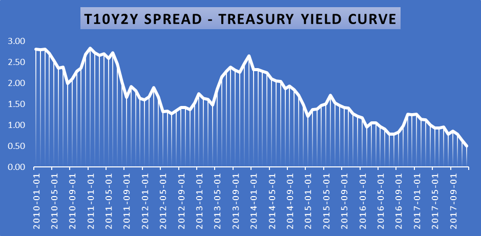
Prior to writing this article, the author embarked on search for patterns in data from over 30 economic indicators. The image above shows there is suggestive evidence that the treasury yield curve (shown in orange) is an important predictor of economic cycles. The four datasets graphed above, follow the peaks and troughs of the U.S. economic cycles dating back to the early 1970’s. The data has been tested for statistical significance and predictive modeling power, but the reader of this article is cautioned to do the same. As implied by the data, a flattening of the treasury yield curve (spread between the 10-year and 2-year treasuries), does in fact precede an economic downturn. Specifically, once this spread falls below zero, an increase in the number of weekly unemployment claims tends to follow.
The spread has come its closest to zero since 2006; long before the start of the Great Recession.
 Source: St. Louis FRED
When you start getting into spread data from these yield curves, history tells us that significant changes in these spreads tend to indicate changes in economic conditions are coming. Naysayers throughout the last two major downturns argued that signals from the spreads were broken, and they are saying the exact same thing about the spread right now. The charts below, generated quite a bit of interest in the comments section of the article linked in the introductory paragraph. Initially, some believed the yields on longer-term treasuries were repricing geopolitical risk. However, the persistence of this trend now questions that argument.

Empirical Signals from CBOE's VIX and the University of Michigan’s Survey of Consumer Sentiment
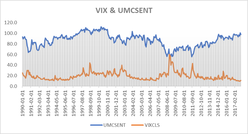
Another interesting observation is found by studying at the relationship between the CBOE Volatility Index (VIX) and the University of Michigan’s Survey of Consumer Sentiment. While not exactly a closely held secret, the data are inversely correlated. More specifically, consumer centiment tends to start into a downward trend just before volatility starts to trend higher. This is a key piece information to tuck away because more recently, consumer sentiment has started to pullback from record highs set just last year. Further, volatility as measured by the VIX has stabilized indicating the VIX short trade may be over, perhaps ahead of increased stock market volatility. It is important to note that lower consumer sentiment does not actually start to become a problem until the measure falls below 80. This is when volatility spikes the most, as financial markets react to the information. Observe spike in the date from June 2008, in chart above.
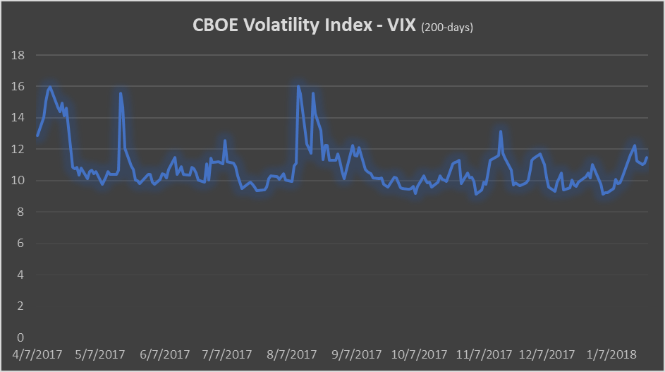
The CBOE Volatility Index’s (VIX) recent downtrend appears to have stabilized.
In the months preceding the economic contraction which began in December of 2007, the Federal Reserve System was already conducting monetary policy experiments that went unnoticed. For instance, the Fed extended swap lines with European banks, to help avoid the start of a panic. During the same period that CNBC’s Jim Cramer was ranting on about the Fed Chairman Ben Bernanke’s ignorance, economists at the Fed were working hard to understand the systemic panic that was unfolding. Deciphering mixed signals to predict an economic downturn was just as challenging back then as it is today.
Despite efforts and rare cooperation across federal agencies, the Federal Reserve was unable to limit the all risks-off series of fire selling panics in 2008. The Federal Reserve is tasked with achieving maximum employment and price stability. Certainly, Fed officials would be reluctant to communicate information that may trigger panic selling, even in the midst of another economic contraction. To expect the Fed to accurately predict and communicate when financial assets become too risky, is a far-fetched assumption to make. Just as it is to expect the Fed to smoothly weather-out the next threat to the stability of the financial system.
In reality, actions taken by regulators during the crisis were not much different from President Roosevelt's declaration of a Federal “Bank Holiday,” during the bank runs of the Great Depression. Yet the world today is vastly different from what it was back then. For instance, just 10 years ago the term block-chain was non-existent and digital bytes of data hold the Fed’s excess reserves. The Fed is now on the brink of downsizing its balance sheet of nearly $4.5 trillion in U.S. treasuries and asset-backed securities. During this same period, the U.S. Department of Treasury's accumulated debt increased to just under $1 trillion.
No one can say with high degree of certainty precisely when we will start to see an economic downturn, However, one could say at least with some certainty, that the Federal Reserve, Dodd-Frank Act, and all the CCAR and stress testing requirements in the world will not be able to hold off a market-wide attempt to derisk a balance sheet of unhealthy, rapidly depreciating financial assets. If financial regulation, monetary and fiscal policy is indeed able to prevent it, it would be the first time in our world’s history.
The charges, however, beg the question: What if corporate tax cuts are not permanent? Well, these charges might just prove to be very expensive. This is a rational argument to propose. The GOP appears to be losing the stranglehold the party has had over Washington, since 2010.
We'll conclude with a quote ripped off the profile bio-description of Twitter user,@DonDraperClone:
“Debt is future consumption denied. Excessive debt is economic stagnation ensured.”
Don't miss the next breaking macro investing idea! Seeking Alpha's premium research subscribers get early access to top macro investing ideas.
Disclosure: I/we have no positions in any stocks mentioned, and no plans to initiate any positions within the next 72 hours.
I wrote this article myself, and it expresses my own opinions. I am not receiving compensation for it (other than from Seeking Alpha). I have no business relationship with any company whose stock is mentioned in this article.